There has been SO MUCH hubbub lately over Facebook and its new News Feed. Then, today was the F8 where the spoke about even MORE changes. As most Facebook users, I was skeptical. I was even a bit angry and frustrated by the change at first, myself. However, I got over this frustration and realized that they were trying to make these changes for a reason. I would adapt and cope and learn to love them like I have the past countless updates.
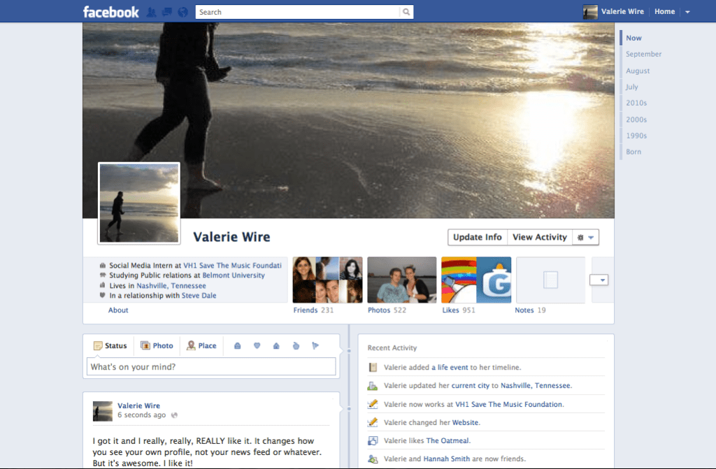
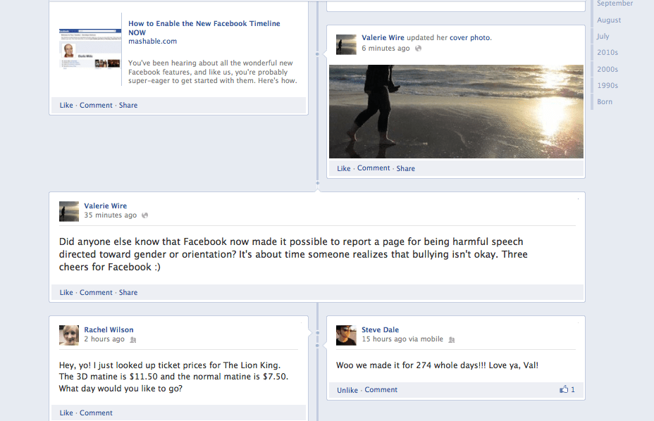
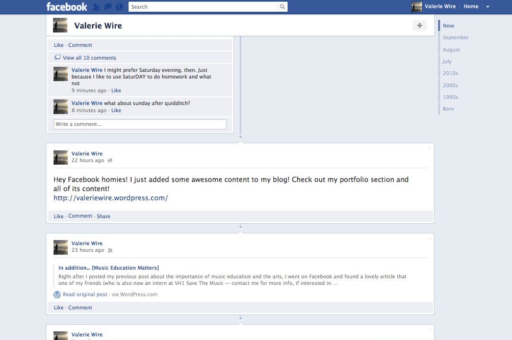
BUT! When I heard about the announcements at the F8 I became EXCITED! I was interested in this new way of viewing profiles, or seeing things in a “timeline” with photos and featured content, and a scrapbook of your and your friends’ lives. I was so fascinated and ready for this to launch. Then, to add to my joy, I found that Mashable posted info and steps on how to get the new Facebook Timeline NOW before it rolls out at the end of this month. So, of course, I jumped on it. And I’d like to share my experience with you, or more so, my images! Because, after all, we’re more about aesthetics and how nice it looks and how easy it is to use anyway, right? That has to have something to do with Diffusion of Innovations (and by has I mean, IT DOES.). So, here it is. Here are four screen shots of my *NEW* Facebook Timeline, which will only be seen by me until it rolls out to all users at the end of this month. However, my only regret is that I didn’t “take the tour” first before I set it. Maybe I’ll have this opportunity again when it officially rolls out…
As you can see, you can upload or use a previously uploaded image to create a “cover.” Something that most of us on WordPress would call a “Header.” I, personally, like this, because I think it can give Facebook a much more professional and “official” feel. Granted, I’m sure there will be many misuses of it that occur, but I love the addition.
Another thing that I particularly enjoy is the “featured” option. Going through my timeline, I can select certain stories to be featured, or not. Featuring a story pulls it out from half of the page in its tiny box, to a full width story, immediately drawing the reader’s eye in. I think this is great, especially when utilized correctly. It could also enhance some professionalism on Facebook, drawing readers to the more important content, rather than just the discussions with friends and family.
You also see on the side, it has the years that Facebook as been around. If you weren’t on Facebook then, the content is empty. I could, however, go back and insert images or other content as I desire. I could even go back to my birth and insert a photo! If only I had a good image of me as a bald newborn to share with the world…
If you keep scrolling, which I do not have images of, it shows more summaries of whom you’ve become friends with over the month, new likes, events you’ve attended, and so on. Then you can continue to scroll through older content.
Overall, I really enjoy this new layout and I can’t wait to see more advantages (and maybe even the disadvantages) of it along the way as I and others become more familiarized with it. If you’re as interested as I am, I definitely recommend following the stages on Mashable’s website to get the new timeline before anyone else! It’s easy and worth it!


